Tilburg’s DNA in letters, symbols and pictograms
Tilburg’s DNA in letters, symbols and pictograms
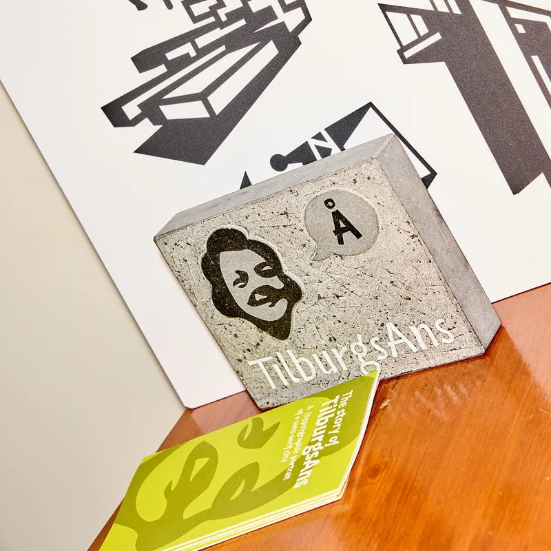
An art project that’s been connecting Tilburgers for 10 years: that’s TilburgAns. The quirky typeface appears on birth announcements and obituaries, on buildings, paving stones, T-shirts, tattoos and even a cheese. Thanks to the TilburgAns adoption plan, 178 letters and punctuation marks, and even more numbered spaces adorn the walls of businesses, homes and cultural venues across the city. Ivo van Leeuwen: “The woman who adopted the umlaut said, visibly emotional: ‘I’ve found myself again’.”
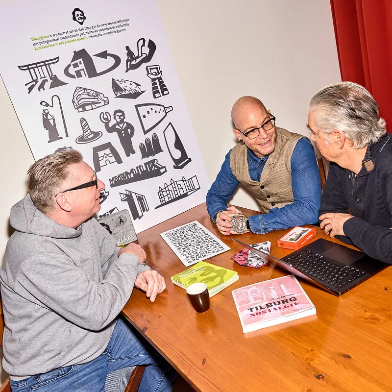
They never expected it to get so out of hand, neither typographic designer Sander Neijnens, nor graphic artist Ivo van Leeuwen. It started with a font that Sander developed for his own use: “Nice for quotes.” When it didn’t work to add a pictogram from the uber-Tilburger – ‘de kruikenzeiker’ – Sander got illustrator Ivo involved. The project became crazier and bigger; they set out to find what defines Tilburg and came up with terms like quirky, raw, humorous, experimental and even vibrant. Elements of Tilburg as it is – based on input from the city’s residents, whom they actively consulted – were incorporated into both the font and the pictograms. Sander: “That rawness is reflected in the sans-serif lettering. And the humor,” he points to the TilburgAns ‘ij’, almost like a smiling face, “you see. Or the ‘Q’, that is kind of a balloon. TilburgAns is Tilburg.”
The power of TilburgAns is that it started from the bottom up, independently. And that’s how it needs to stay. By Tilburgers and for Tilburgers. Where everyone can choose what to do with it next.
Ivo van Leeuwen
Typography with emotion
Everyone can use the font and pictograms if they want. It’s free. And that happens, on a large scale; Tilburgers have wholeheartedly embraced the typeface. Ivo: “A friend’s father said: ‘When I die, the memorial card must be in my font.” Sander often sees obituaries in TilburgAns in the newspaper: “remarkable, right? That someone wants their last message to the world specifically in that typeface.”
What TilburgAns is used for, continues to surprise them. A real estate agent in ‘de Plint’ has his company name written largely in TilburgAns on the window. And not so long ago, when Sander walked with his daughter around the ‘Stadsforum’, they discovered that the Tilburg city charter had been etched into the paving stones in TilburgAns. Smiling: “Ivo and I had no idea about that.”
By Tilburgers, for Tilburgers
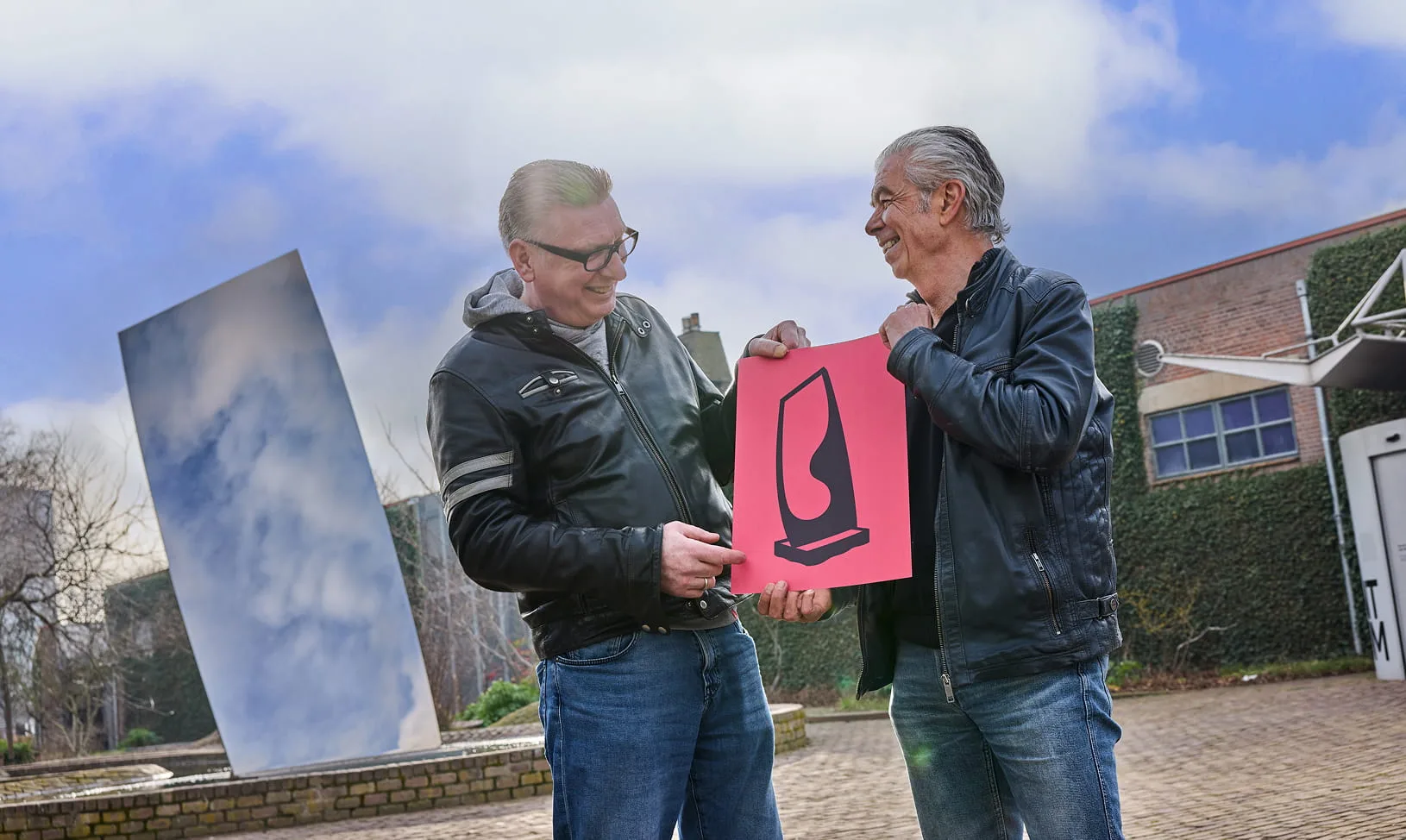
Ten years after its birth, TilburgAns is still thriving. And that comes mostly from the fact that Tilburgers have so firmly embraced the typeface. Typography that represents the spirit of a city so well is unique in the world. Through the years, TilburgAns has grown into a mature and fully-fledged typeface. Letters, spaces and symbols continue to be adopted and requests for pictograms that Tilburgers believe should be included keep trickling in. “Look here,” points Sander, “this is the new spire in the ‘Armhoefse Akkers’ neighborhood.”
Letters, spaces and symbols continue to be adopted and requests for pictograms that Tilburgers believe should be included keep trickling in. Just like the new spire in the ‘Armhoefse Akkers’.
Sander Neijnens
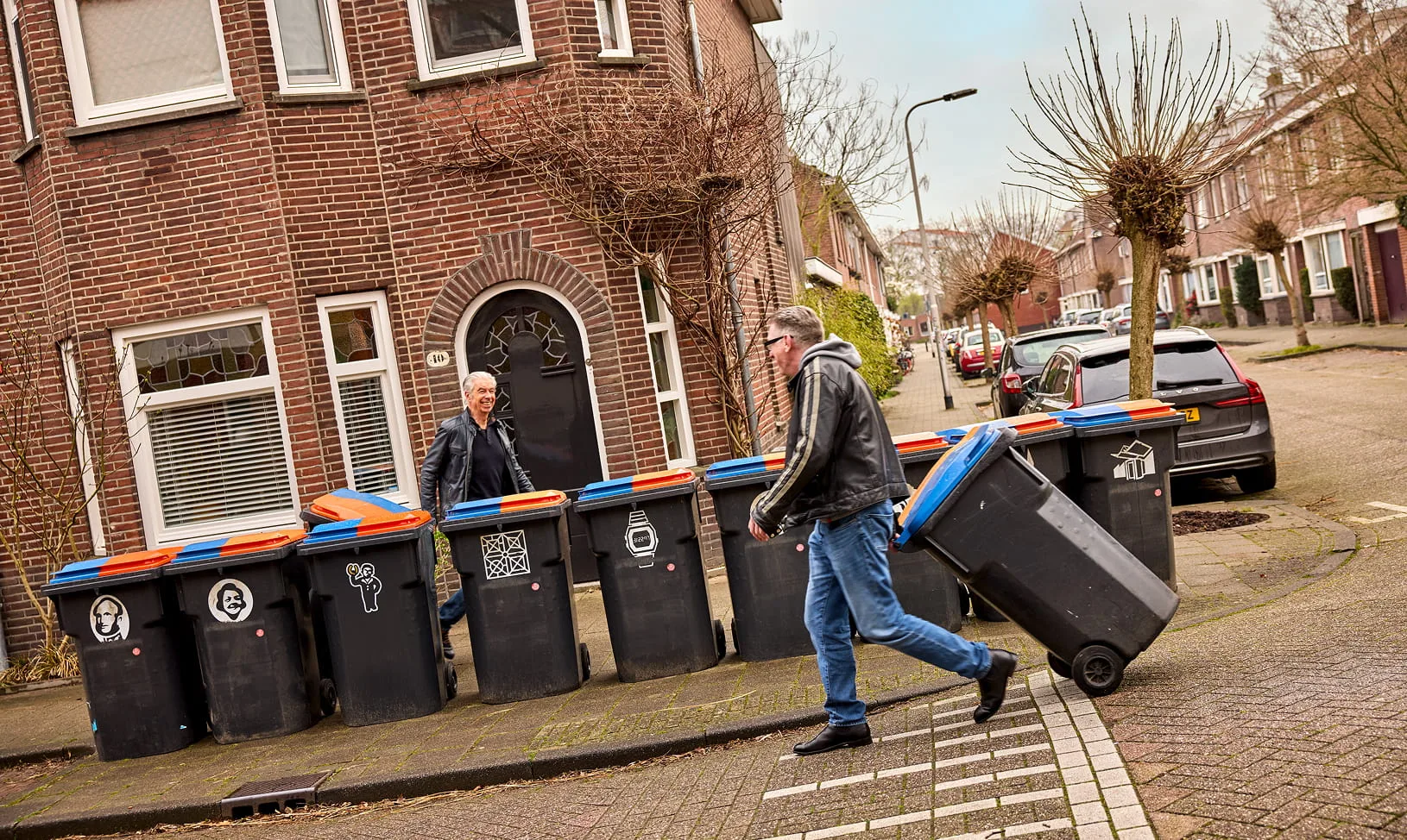
Requests are welcome but Sander and Ivo have the last say. Just turning a commercial building into a TilburgAns pictogram because a company pays a lot for it? That’s not how we do things. Ivo: “The power of TilburgAns is that it started from the ground up, independently. And that’s how it needs to stay. By Tilburgers and for Tilburgers. Where everyone can decide for themselves what to do with it next.”